Metadata
- Source
- VP-2
- Type
- Bug
- Priority
- Major
- Status
- Closed
- Resolution
- Duplicate
- Assignee
- N/A
- Reporter
- heidi valles
- Created
2012-10-30T12:46:32.258-0400 - Updated
2013-01-28T09:25:20.261-0500 - Versions
- N/A
- Fixed Versions
- N/A
- Component
- N/A
Description
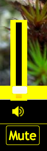
Change image when slider is in use, as per J's mockups.
Note: This applies to the button that activates the slider. The colours of the button are not inverted.
Attachments
Comments
-
heidi valles commented
2012-10-30T12:47:24.989-0400 volume button should be yellow bg with black icon
-
heidi valles commented
2012-10-31T16:59:20.071-0400 After a chat with Michelle clarifying J's mockups, the button should only change when the slider is active, which is I think only do-able with javascript (if slider handle is focused, change style on mute button). Not sure we want to do this right now.
I did fix the style so that the hover style applies when hovering over slider. However, wb and yb don't have hover-styles for the mute button (the default/other themes give a fadey border).
-
heidi valles commented
2012-12-12T14:22:32.836-0500 The styling happens when the volume container is focused. This works fine for keyboard users, but when accessing the slider via mouse, the container doesn't seem to contain the slider, and the focus styling doesn't apply.
Overall, colours/shadowing/icons for the buttons, when active/hover, should be revisited to add consistency across the themes.
-
Jonathan Hung commented
2013-01-21T15:23:10.822-0500 Very likely the same issue. The button does not take the hover style when the slider is in use.